
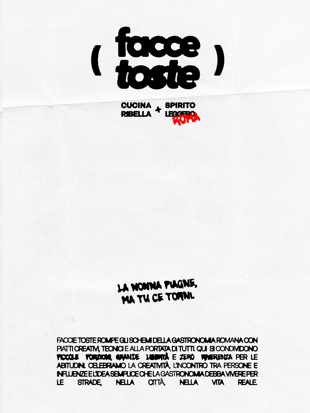
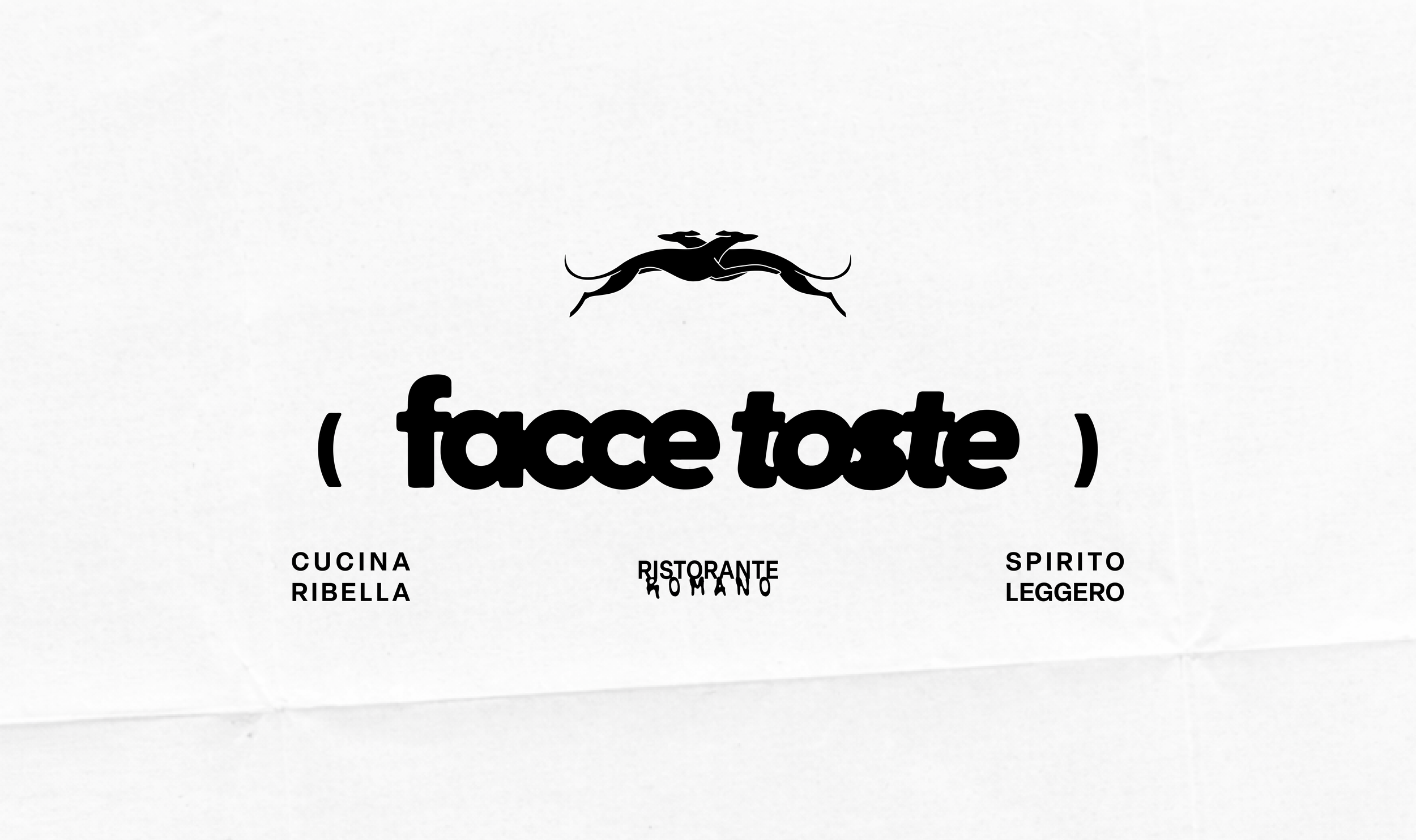
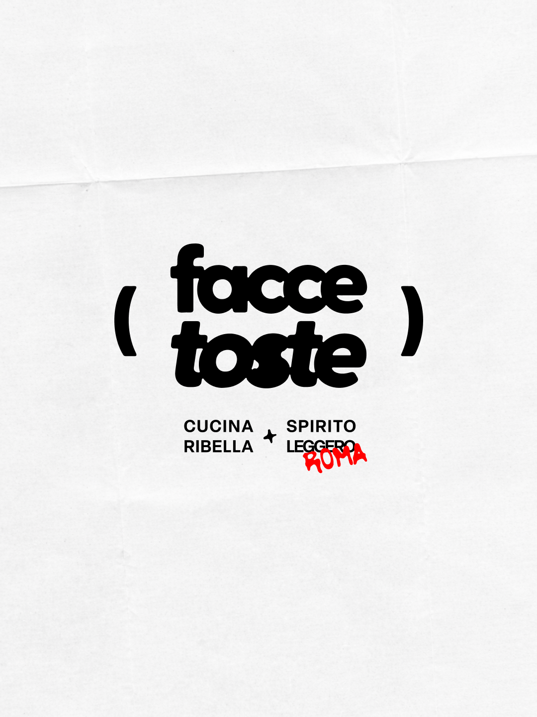
( FACCE TOSTE )
In the middle of noisy, postcard‑perfect Trastevere, Facce Toste refuses to play the trattoria nostalgia game. This restaurant treats gastronomy like a playground: small plates, sharp technique, big ingredients and zero reverence for “how things have always been done”. Facce Toste is where you go when you love food deeply, but have no interest in behaving nicely around it.
#IRREVERENT
#BOLD
#MODERN
Facce Toste is for young (or just young‑minded) people who care as much about the vibe as about what’s on the plate. They’re curious eaters, used to galleries, gigs and Instagram stories, who want a place in Trastevere that feels like their living room, just with better knives and wilder ideas in the kitchen.
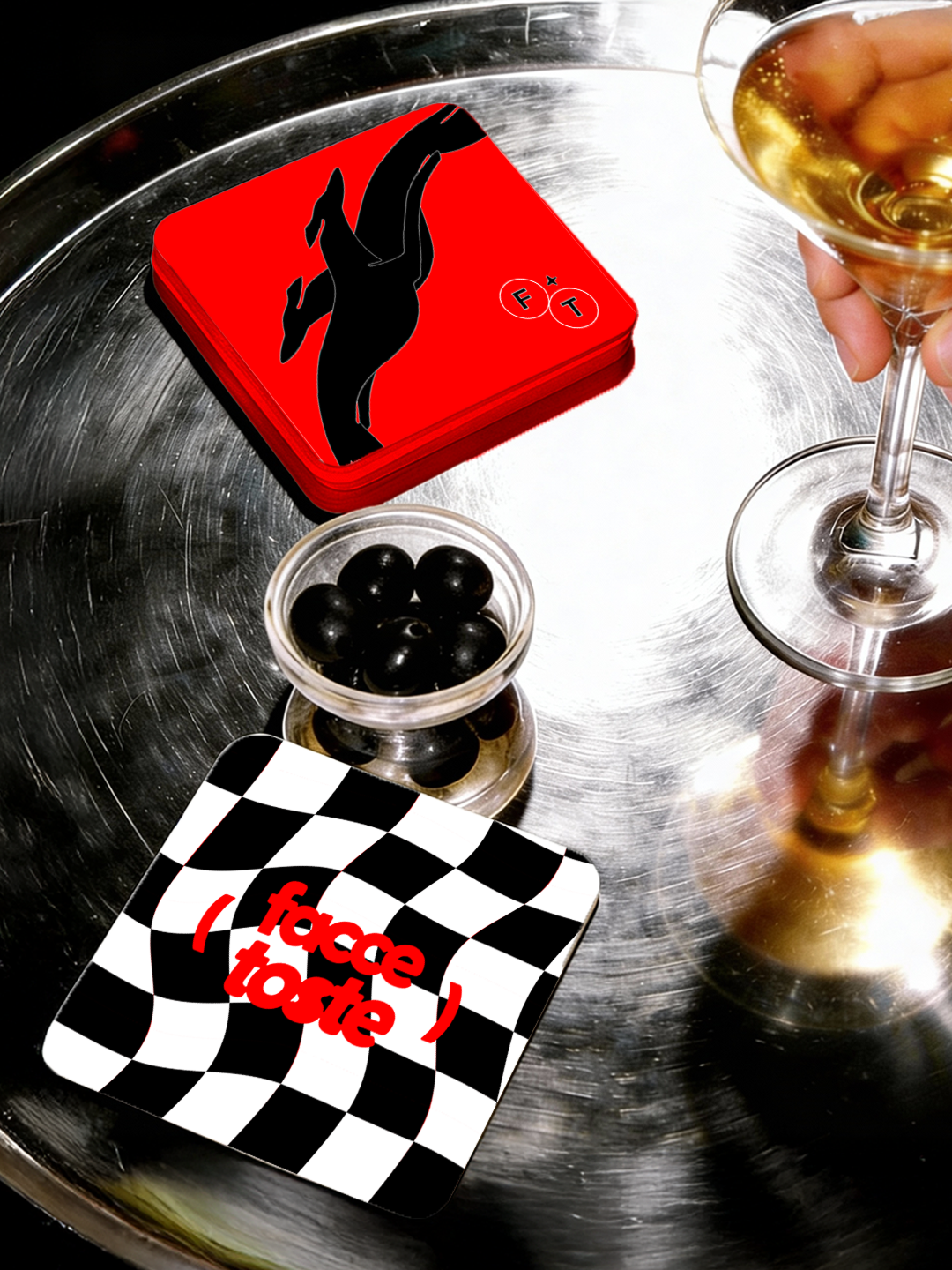
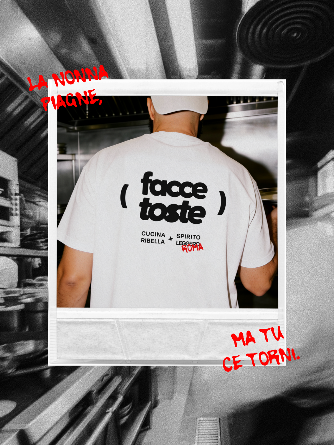
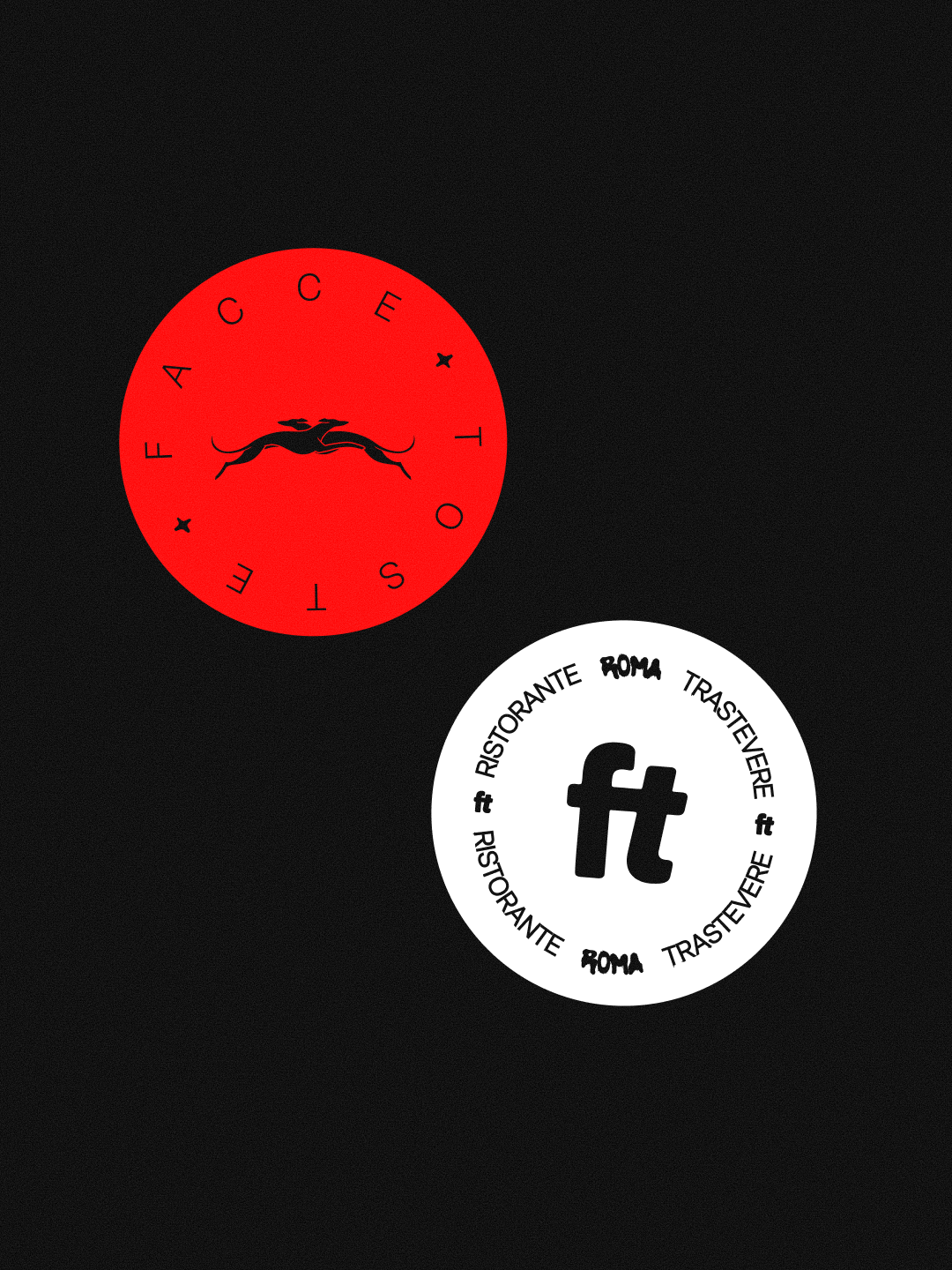
The identity follows them: bold typography, loud red accents for the rebel attitude, and flash photography that captures the same direct, explosive energy as the owners’ cuisine.
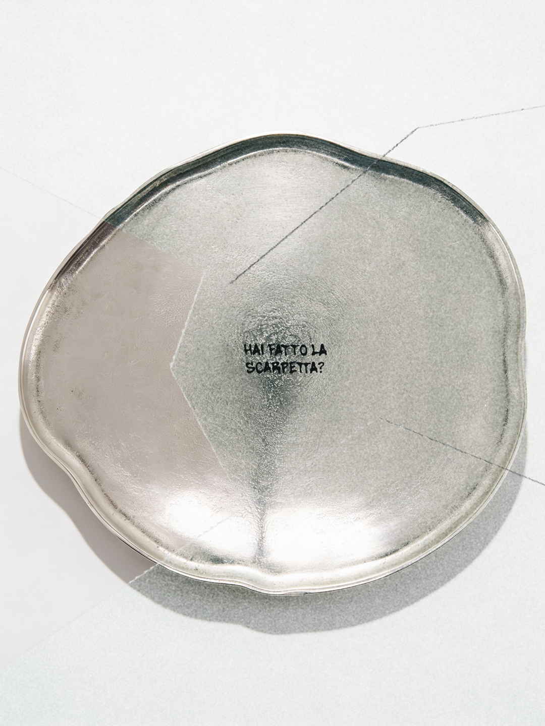
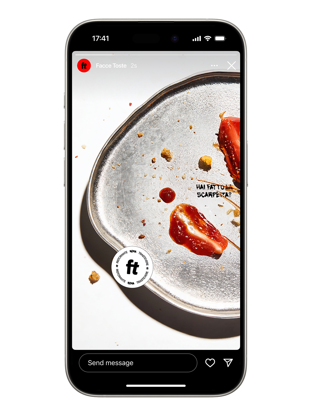
Facce Toste doesn’t seduce with perfect food photography; it tells the story after the meal. The art direction focuses on (almost) empty plates to suggest that the only real review is what’s left behind. By refusing to show composed dishes, the visuals create curiosity and trust at the same time: if every plate ends clean, the food must be worth coming back for. The flash lighting, crumbs and traces of sauce capture that raw moment when the table goes quiet and everyone is busy finishing, turning a simple & convivial act into the central visual ritual of the brand.
The only “complete” plates the restaurant chooses to show are the ones photographed and shared by guests themselves, turning customer photos into the official gallery of dishes and a tool for community building. It’s a deliberately risky choice in a culture of glossy food images, but it underlines the idea that real proof lives in the room, not in staged pictures.
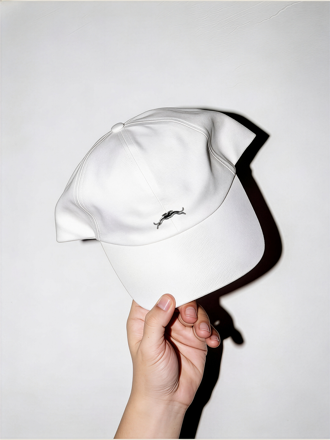
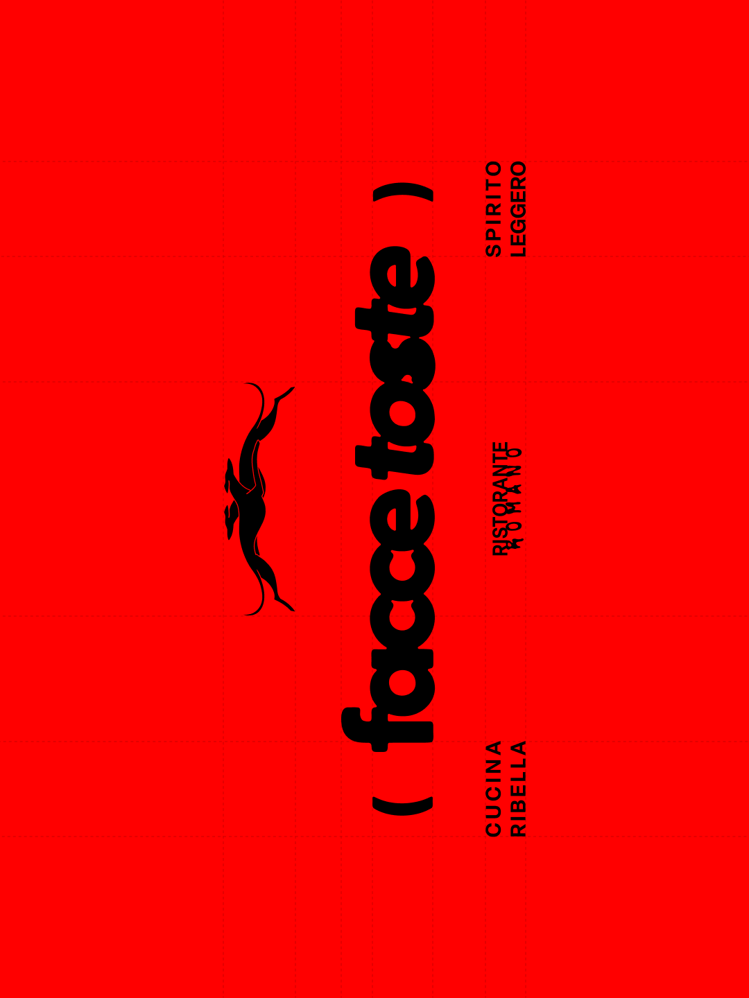
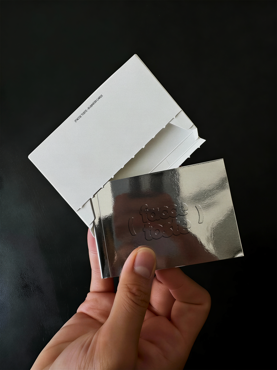
Facce Toste condenses its attitude into a tight, graphic system: bold typography, flash‑lit scenes, handwritten elements, electric red accents and strict layouts subtly disrupted by off‑kilter details. Metallic touches echo the stainless steel of a professional kitchen, grounding the playfulness in serious craft and technique. Together, these choices build a brand that feels sharp, slightly risky and unapologetically bold – exactly like the food and the team behind it.