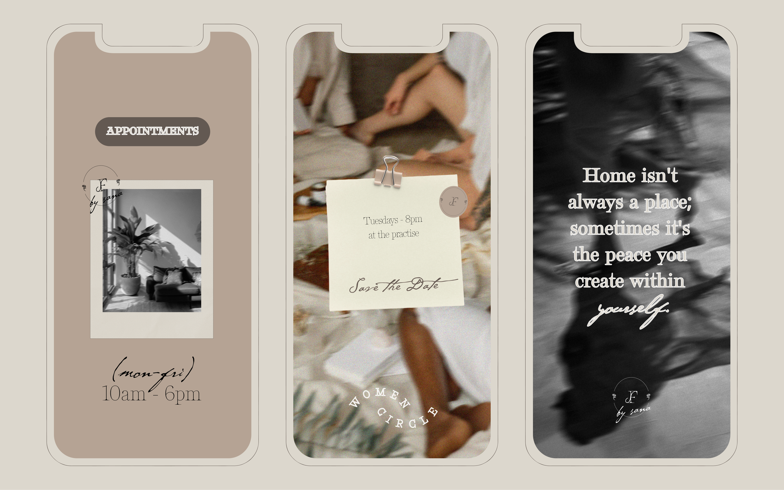
find solace:
An holistic therapy practise, by women, for women.
THE MISSION → to create a conscious, healing space that honors the intimate connection between mind, body, and spirit through holistic therapeutic practices.
THE VALUES → authentic healing without judgment ; slow transformation and mindful presence ; sorority ; transparency and trauma-informed care
THE TARGET AUDIENCE → sensitive, intuitive women (25–45) navigating life transitions, seeking deeper healing & self-connection and a safe community.
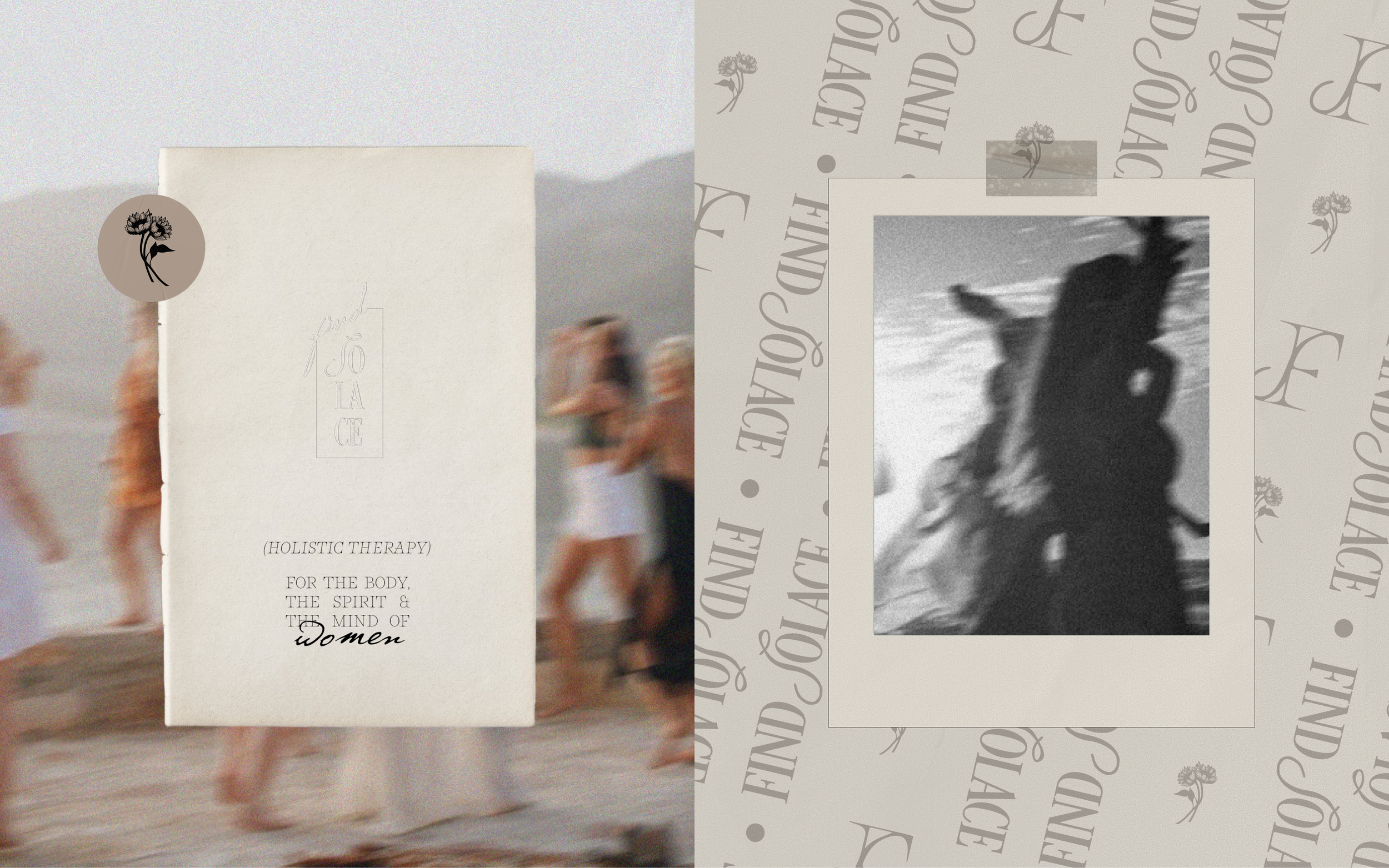
THE AESTHETIC KEYWORDS →
Minimal · Grounded · Elegant · Soothing · Nature-inspired · Analog · Celebrating the sacred feminine
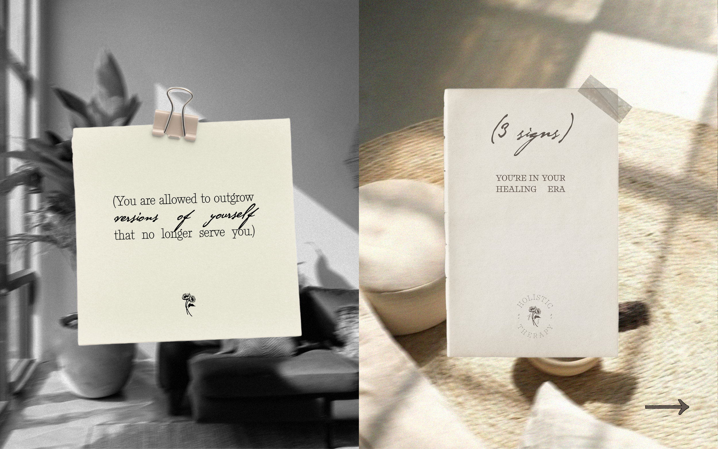
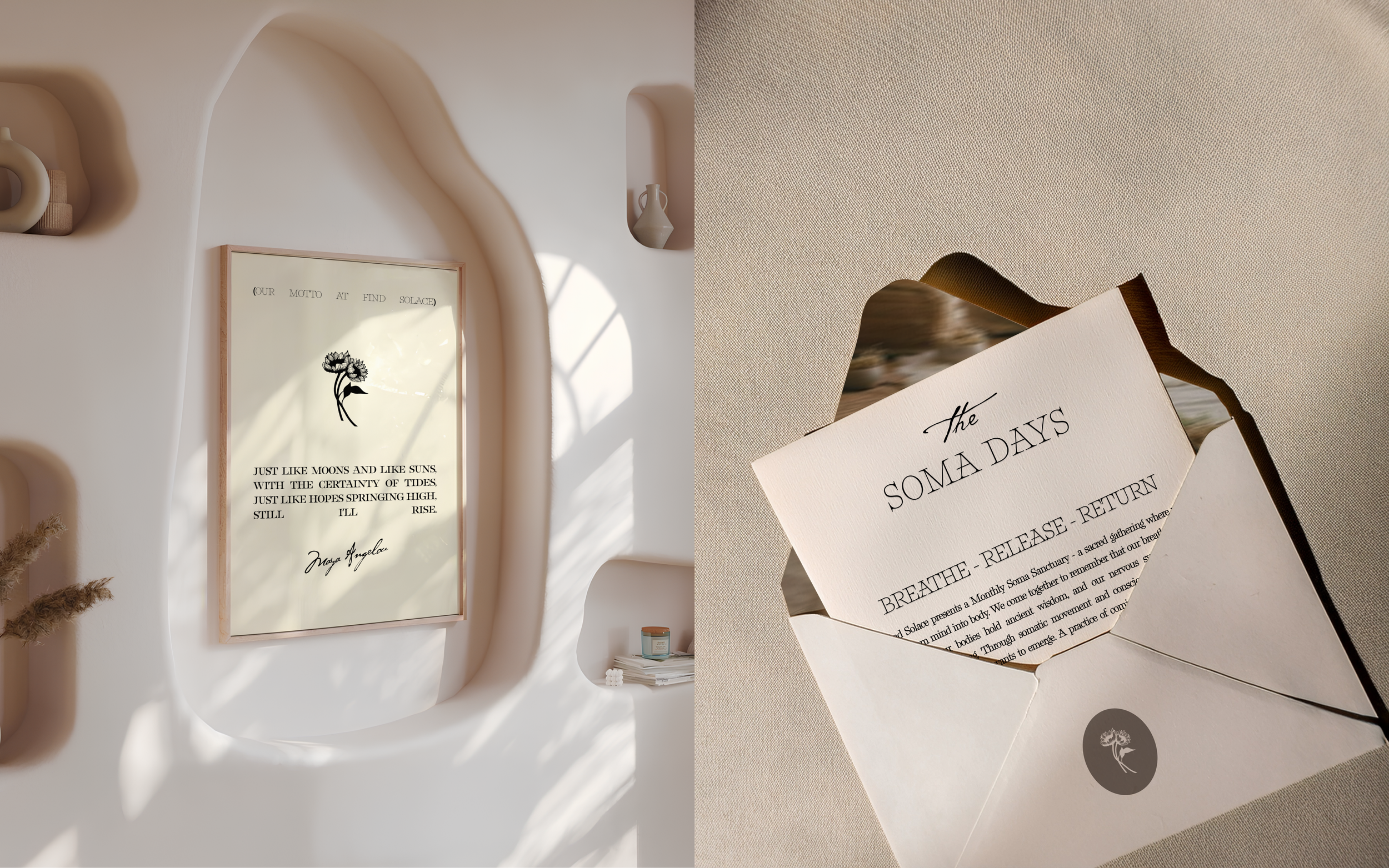
the scope
Visual Identity + Social media presence + Collateral Prints
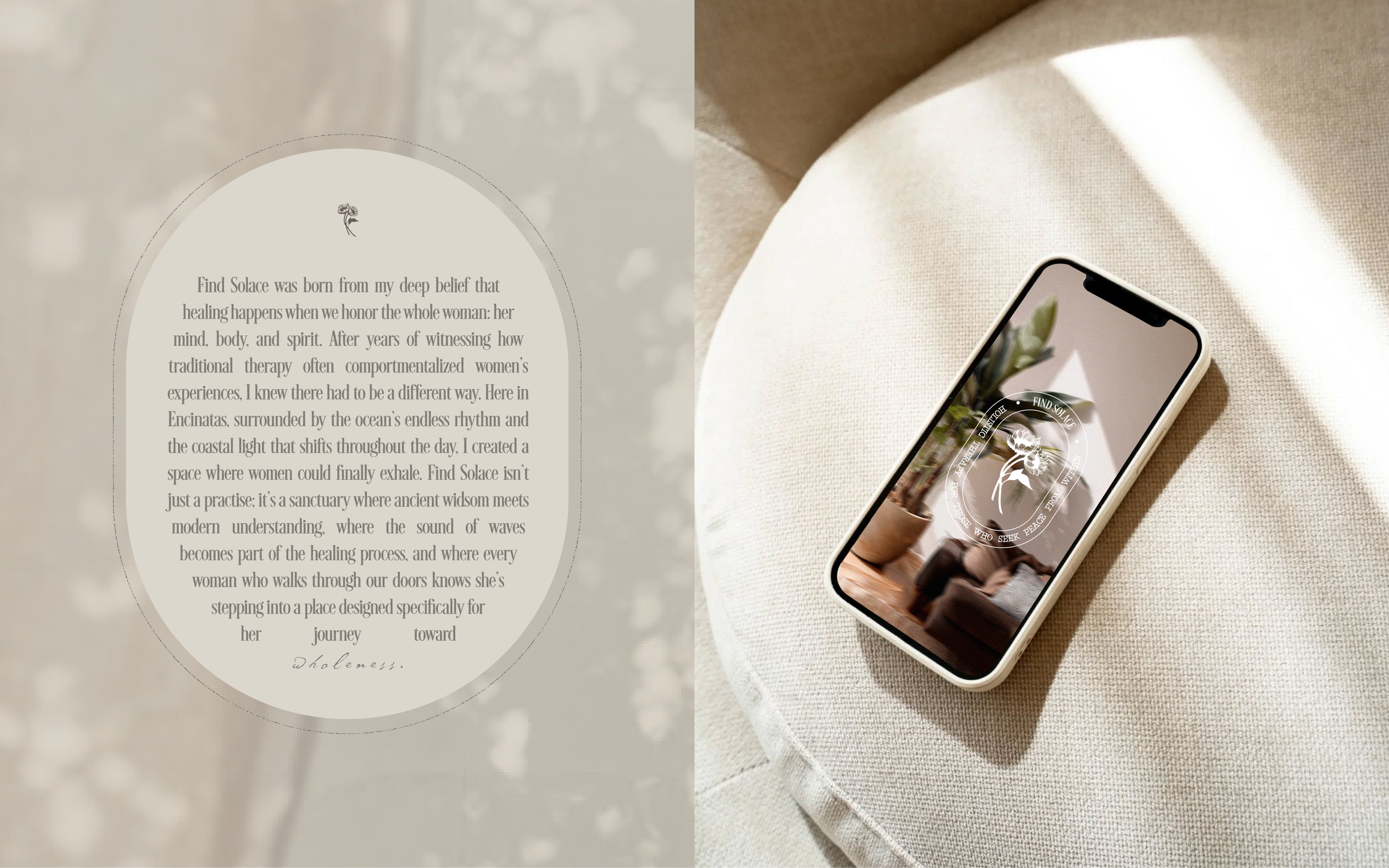
When Sana came to me, she carried a vision of therapy that felt radically different from the clinical spaces she'd experienced. As someone who infuses art and poetry into her daily practice with women, she was determined to reclaim a sense of humanity in our increasingly digital age.
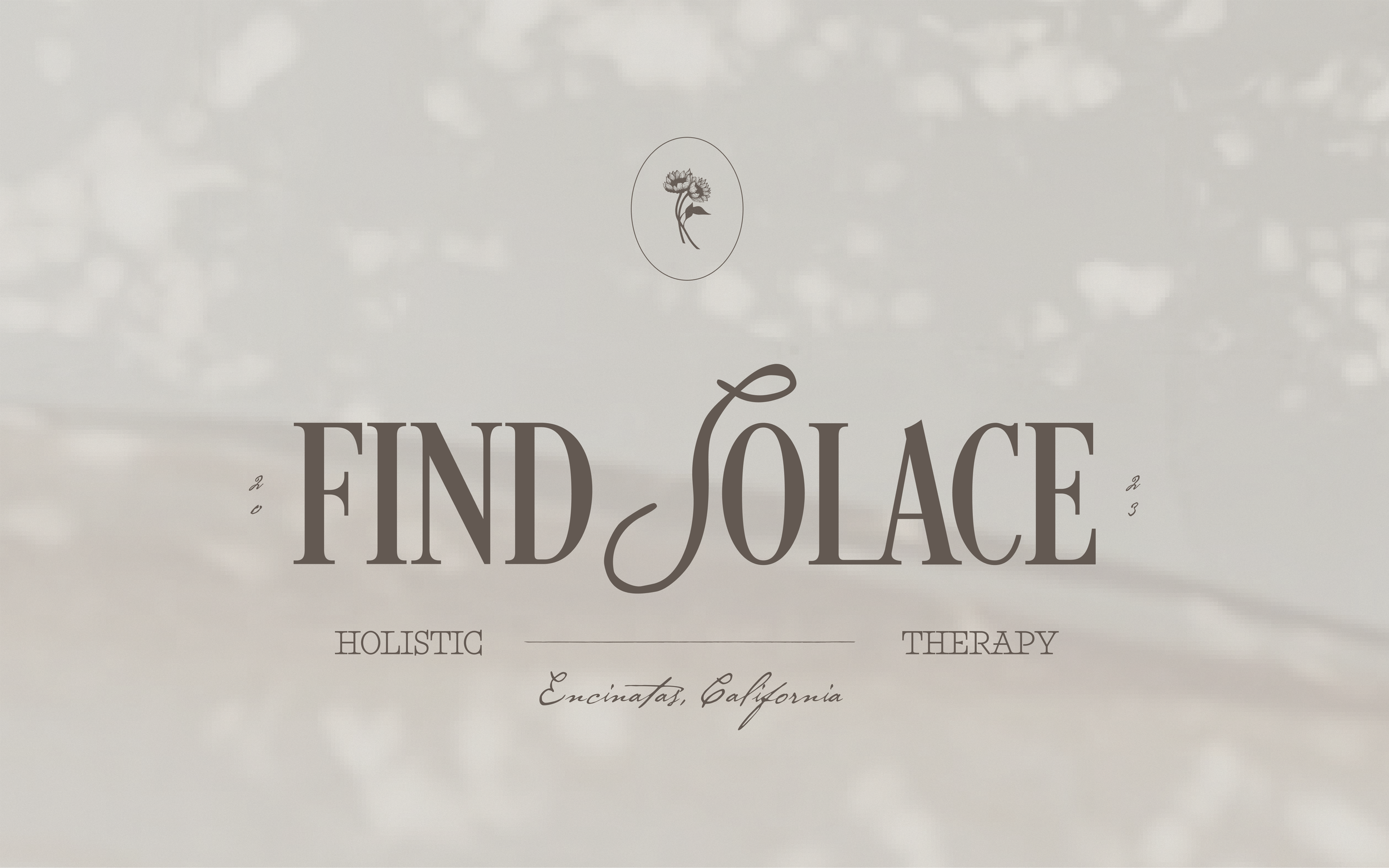
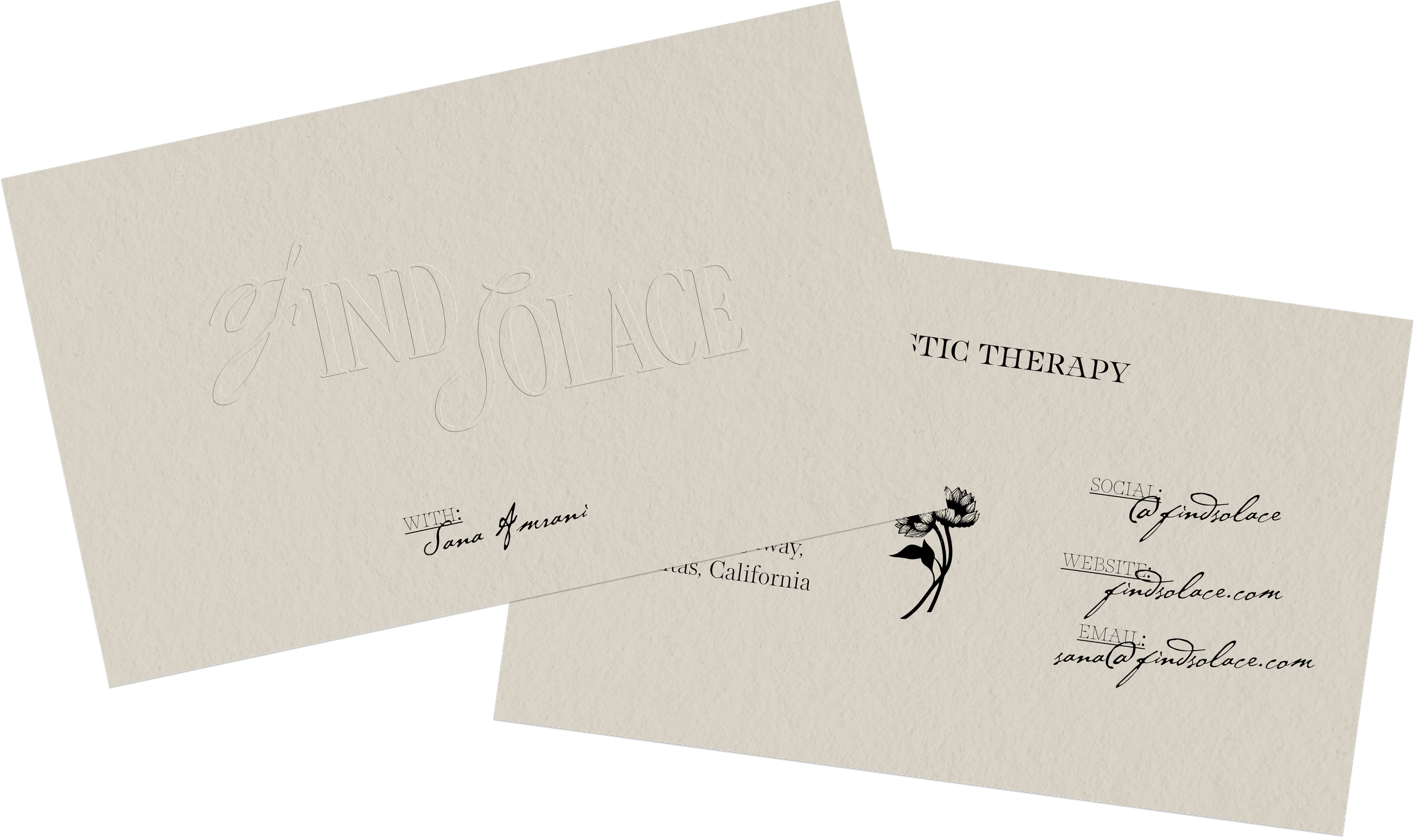
The Typography
→ We paired a flowing script with an elegant serif - a marriage of art and authority. The handwritten feel honors Sana's poetic nature and sensitive approach, while the refined serif establishes the expertise and grounding her clients seek. Together, they capture the duality of Find Solace: deeply feminine and intuitive, yet rooted in real therapeutic knowledge.
The Symbol
→ The hand-drawn sunflowers hold a special meaning for Sana - they’re symbols of resilience that grow toward light even in difficult conditions. We illustrated them as a pair, representing the therapeutic relationship she believes in: two women, equal in their womanhood, in their humanity, standing side by side.
The Colour Palette
→ Inspired by the coastal paradise of Encinitas, where Sana will be building the practice of her dreams. We chose warm neutrals that echo beach sand and natural textures. These earth tones create the sanctuary feeling she wanted - grounded, peaceful, and connected to the healing power of nature.
Embossed details transforms Find Solace from a visual identity into a sensory experience. The subtle elevation of key brand elements - here, the elegant monogram, creates moments of pause and connection. When fingers trace over the raised surfaces of business cards, packaging, or printed materials, there's an immediate sense of craft and intentionality that speaks to the brand's commitment to mindful & authentic experiences.